mobile
How to make a Circular Image View in Android without Third-Party Library
If you are an android developer, chances that you have to create a circular image view is always high. It was never a piece of cake to choose the best method for achieving it. This article is especially for solving this challenge. We have curated the best method for you, where you can create a circular image view easily without using third-party libraries.
Karthik Kamalakannan / 29 August, 2019

In this tutorial, we are going to see how to create a circular image view and a circular image view with border-color in Android. Most of the time the android developers use a third-party library for creating a circular profile image, but this tutorial will explain how to create a circular image view without the help of the third-party library and plugins as well.
Most of the time the usage of third-party libraries degrade the speed and affect the data in an android application.
One of the most common tasks in android is to create a Circular ImageView. The default ImageView in android is rectangle so there are situations where we will have to create a circular ImageView.
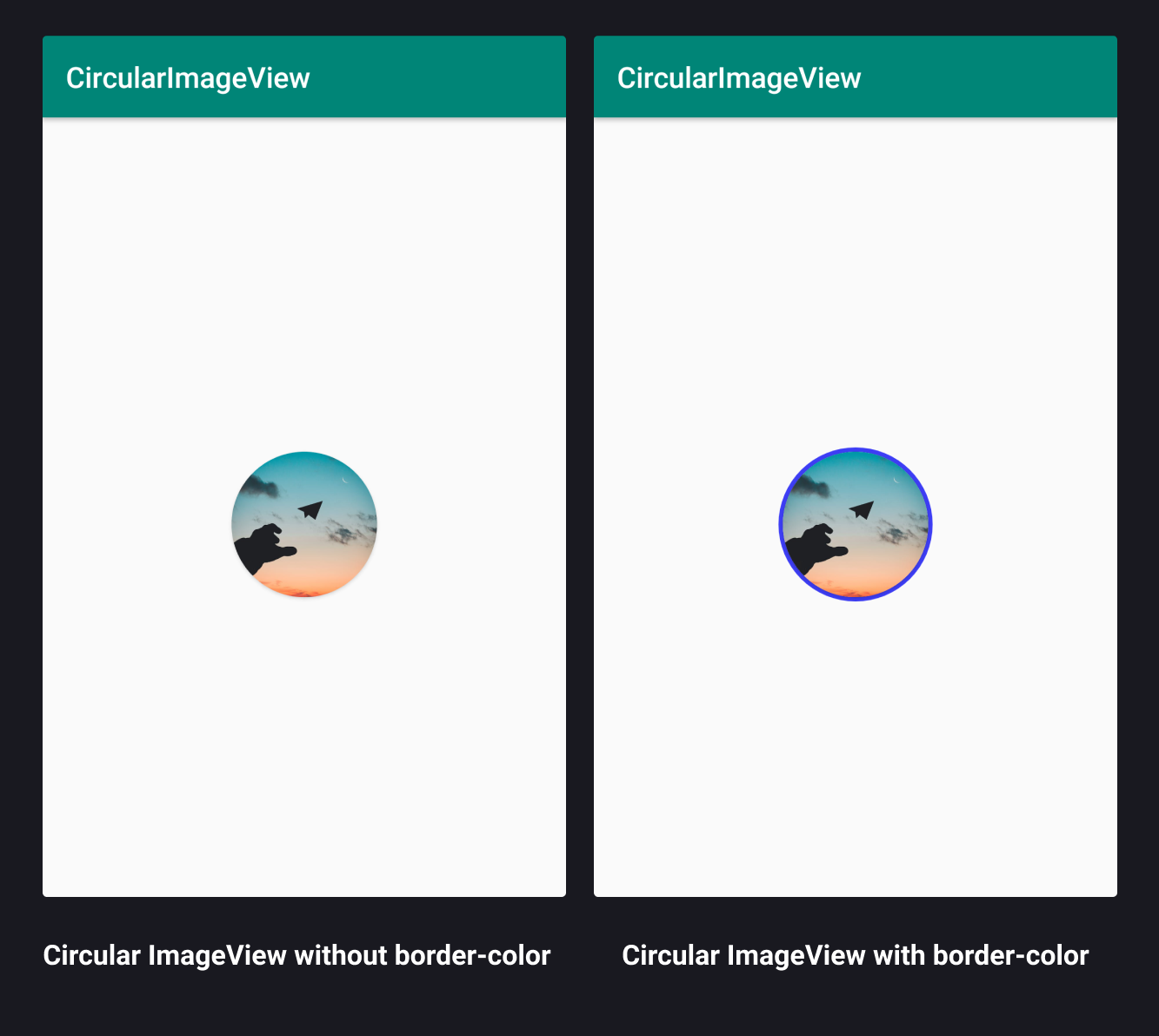
There are different ways to achieve this but before that let us see the result of what we have to achieve. The image below represents the circular image view in the android application.
Steps:
1. Adding Support Library
You need to add the following support libraries to Gradle (Module.app) for CardView to work on your project.
Picasso and glide libraries are used for loading the image from the browser or server. Here, we use these libraries following.
implementation 'com.android.support:CardView-v7:28.0.0'
implementation 'com.squareup.picasso:picasso:2.5.2'
implementation 'com.github.bumptech.glide:glide:4.7.1'
2. Creating Circular ImageView without border-color
We have to create an empty activity and name it as activity_main.xml and MainActivity.java for our future use. In this stage, XML acts as a major role in creating a circular ImageView. You can define the XML code as follows…
activity_main.xml
<RelativeLayout xmlns:android="http://schemas.android.com/apk/res/android"
  xmlns:app="http://schemas.android.com/apk/res-auto"
  xmlns:tools="http://schemas.android.com/tools"
  android:layout_width="match_parent"
  android:layout_height="match_parent">
  <android.support.v7.widget.CardView
      android:id="@+id/myCardView"
      android:layout_width="100dp"
      android:layout_height="100dp"
      app:cardCornerRadius="50dp"
      android:layout_centerHorizontal="true"
      android:layout_centerVertical="true"
      >
        <ImageView
            android:id="@+id/roundedimage"
            android:layout_width="match_parent"
            android:layout_height="match_parent"
            android:scaleType="centerCrop"
        />
  </android.support.v7.widget.CardView>
</RelativeLayout>
You have to put your ImageView inside the CardView because CardView only has a feature of accessing the corner radius attribute. This corner radius attribute helps us to create a rounded ImageView. If you forget to do the below step, your image won't look circular. It will either look like a rectangle or rectangle with a corner radius.
IMPORTANT NOTE: CardView app:cardCornerRadius will double half of your CardView width and height. app:cardCornerRadius always depends on the height and width attribute of the CardView.
3. Creating Circular ImageView with border-color
- Create drawable.xml for circular shape with border-color
- Rewrite activity_main.xml for border-color
Create drawable.xml for circular shape with border-color
You have to create the cicular_bordershape.xml under the drawable folder. It will set the border color for the ImageView. You can define the XML code as follows…
circular_bordershape.xml
<shape xmlns:android="http://schemas.android.com/apk/res/android" android:shape="oval">
   <solid android:color="#fff"/>
   <stroke android:width="3dp" android:color="#3d3df5" />
</shape>
IMPORTANT NOTE: <stroke> is used to set the border width and as well as the border color.
Rewrite activity_main.xml for border-color
This is how you rewrite the activity_main.xml code for border-color. You can define the XML code as follows…
activity_main.xml
<?xml version="1.0" encoding="utf-8"?>
<RelativeLayout xmlns:android="http://schemas.android.com/apk/res/android"
   xmlns:app="http://schemas.android.com/apk/res-auto"
   xmlns:tools="http://schemas.android.com/tools"
   android:layout_width="match_parent"
   android:layout_height="match_parent"
   >

   <RelativeLayout
       android:id="@+id/shape_layout"
       android:layout_width="106dp"
       android:layout_height="106dp"
       android:background="@drawable/rounded_profile_textview"
       android:layout_centerVertical="true"
       android:layout_centerHorizontal="true"
       >
     <android.support.v7.widget.CardView
         android:id="@+id/myCardView"
         android:layout_width="100dp"
         android:layout_height="100dp"
         app:cardCornerRadius="50dp"
         android:layout_centerHorizontal="true"
         android:layout_centerVertical="true"
         >
             <ImageView
                 android:id="@+id/roundedimag"
                 android:layout_width="match_parent"
                 android:layout_height="match_parent"
                 android:scaleType="centerCrop"
              />
     </android.support.v7.widget.CardView>
   </RelativeLayout>
</RelativeLayout>
The CardView should be placed inside the RelativeLayout. We use this RelativeLayout to apply the background as drawable.xml for border-color, it gives your ImageView with border-color.
IMPORTANT NOTE:
RelativeLayout height and width calculation formula:-
C:A + (B * 2)

A => CardView view height & width attributes in dp ( e.g 100dp )

B => Border stroke width in dp ( e.g 3dp )

(B * 2) => 3dp * 2:6dp

C => 100dp + 6dp:106dp ( should be added at the width & height attribute of RelativeLayout )
(dp- Density independent pixels)
4. Load the image using Glide and Picasso tool
As mentioned above, Glide and Picasso libraries are used for loading the images from the server or browser. That's why we use these libraries for image loading. Custom view also loads the image from the server.
MainActivity.java
public class CircularAvater extends AppCompatActivity {

   @TargetApi(Build.VERSION_CODES.LOLLIPOP)
   @Override
   protected void onCreate(Bundle savedInstanceState) {
      super.onCreate(savedInstanceState);
      setContentView(R.layout.activity_circular_avater);

      ImageView roundedimag:(ImageView) findViewById(R.id.roundedimag);
        // Load an image using Picasso library
            Picasso.with(getApplicationContext())
                    .load("YOUR IMAGE URL")
                    .into(roundedimag);

        // Load an image using Glide library
            Glide.with(getApplicationContext())
                  .load("YOUR IMAGE URL")
                  .into(roundedimag);
   }
}
This brings us to the end of the blog post. I hope you have learned about creating circular imageview with a border for your android application. Now, you can run this on your android device and see the output for yourself.

Last updated: January 23rd, 2024 at 1:50:36 PM GMT+0