dev
Rise of Tailwind - A Utility-First CSS Framework
What if there is an easy way to achieve responsive UI without using any UI kit? Can we create new and fresh designs for every project with a CSS framework? Enter Tailwind CSS, will this be the perfect CSS framework, well let's find out.
Karthik Kamalakannan / 23 July, 2020

Tailwind is a utility-first CSS framework, the keyword being 'utility'. It is basically a set of classes that you can use in your HTML.
For instance, to recreate the following button, we can use:

<button class="bg-purple-700 px-4 py-1 text-white">Button</button>Here the classes are prebuilt by tailwind to give the following CSS:
.bg-purple-700 {
  background-color: #6b46c1;
}
.text-white {
  color: #ffffff;
}
.py-1 {
  padding-top: 0.25rem;
  padding-bottom: 0.25rem;
}
.px-4 {
  padding-top: 1rem;
  padding-bottom: 1rem;
}
Therefore, we don't have to write any custom CSS to get this button. This can be heavily extended to build whole web applications without the need for any other styles apart from a tailwind.
Benefits of Tailwind that I love
- No need to write any responsive media queries any more
If you want something to display on mobile and not on the desktop, add the class block md:hidden. As this is a mobile-first approach, that element will have display: block on mobile and after the md breakpoint, which is 768px, it will toggle to display: none.
- Consistent spacing and typography
As everything in utility classes is predefined, we will have consistent padding and margin throughout our platform. And, typography in tailwind is the best, you don't have the need to change any of the default config yet.
- PurgeCSS built-in
It has the ability to remove unused CSS that we didn't use in our app. It does this with the help of purge css built-in within tailwind. This gives loads of size savings on the final CSS build.
Let's build something...
Now let's build a simple alert component to see how tailwind works in detail. Enter the following command in your terminal, make sure you have Node installed.
mkdir tailwind-alert
cd tailwind-alert
npm init # Follow the steps to initialize a npm project
touch index.html postcss.config.js main.css
npm i -save tailwindcss postcss-cli
In your index.html, postcss.config.js and main.css copy the following code:
<!-- index.html -->
<!DOCTYPE html>
<html lang="en">
<head>
<meta charset="UTF-8" />
<meta name="viewport" content="width=device-width, initial-scale=1.0" />
<link rel="stylesheet" href="tailwind.css" />
</head>
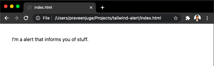
<body class="m-10">
<div role="alert">I'm an alert that informs you of stuff.</div>
</body>
</html>// postcss.config.js
module.exports:{
plugins: [require("tailwindcss")],
};/* main.css */
@tailwind base;
@tailwind components;
@tailwind utilities;Finally, add the following script in your package.json:
// package.json
...
"scripts": {
"start": "postcss main.css -o tailwind.css --watch"
},
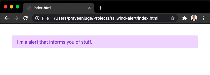
...Now do npm start in your terminal and open index.html in your browser, you should see this:
Style with tailwind
Let's style it with a tailwind! For a typical alert component, we need to give a background color and text color first. So in your index.html, change the following:
<div class="bg-purple-200 text-purple-700" role="alert">
  I'm an alert that informs you of stuff.
</div>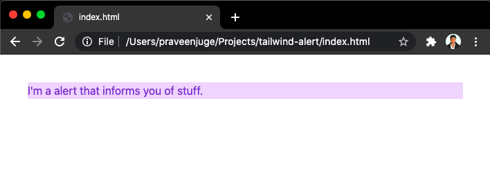
Now let's add some padding with rounded corners, for padding we have p-{n} utilities and border radius can be also given with utility classes.
<div class="rounded bg-purple-200 px-4 py-2 text-purple-700" role="alert">
  I'm an alert that informs you of stuff.
</div>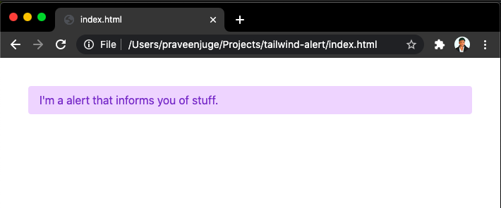
This looks better! But, for reusability, we can make this a component. In your main.css file add the following code:
/* main.css */
@tailwind base;
@tailwind components;

.alert {
  @apply rounded border-2 border-solid px-4 py-2 text-base;
}

.alert-primary {
  @apply border-purple-200 bg-purple-200 text-purple-700;
}

@tailwind utilities;
The @apply is a special tailwind directive that makes it easy to refer to the tailwind utility classes here. Now refresh index.html in your browser and you will see this:
You can now use this alert component everywhere and can change its styles in one place. Since we are using tailwind classes, this will give us better control of spacing, colors and typography compared to our own CSS styles.
Conclusion
As I am using tailwind in my projects, I didn't have the need to use sass or even create multiple stylesheets. Everything I need can be done within the tailwind itself.
Some cons that I see:
- The steep learning curve for new developers
- Postcss takes a long time to compile for big projects
- Initial setup for projects is long
I'm sure the tailwind team will address and solve these issues with the best they can in the future. Check out the official documentation and get started. Happy coding!
For any queries or clarifications, you can always reach out to me at [email protected]
Last updated: January 23rd, 2024 at 1:50:36 PM GMT+0